Dear planet managers, we really struggled a bit to be able to offer you this hyper-speed optimization of the global management system! The interface is the most annoying part of the game production. Let’s hope that the latest interface optimizations will leave nothing to be desired!
Control optimization
Fast and universal switching between temples, workshops, cities, factions and merchants is finally possible and revolutionizes the navigation in our game.
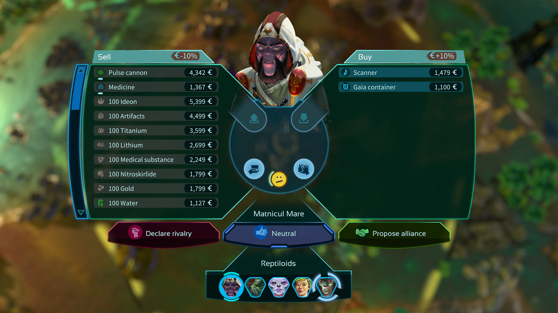
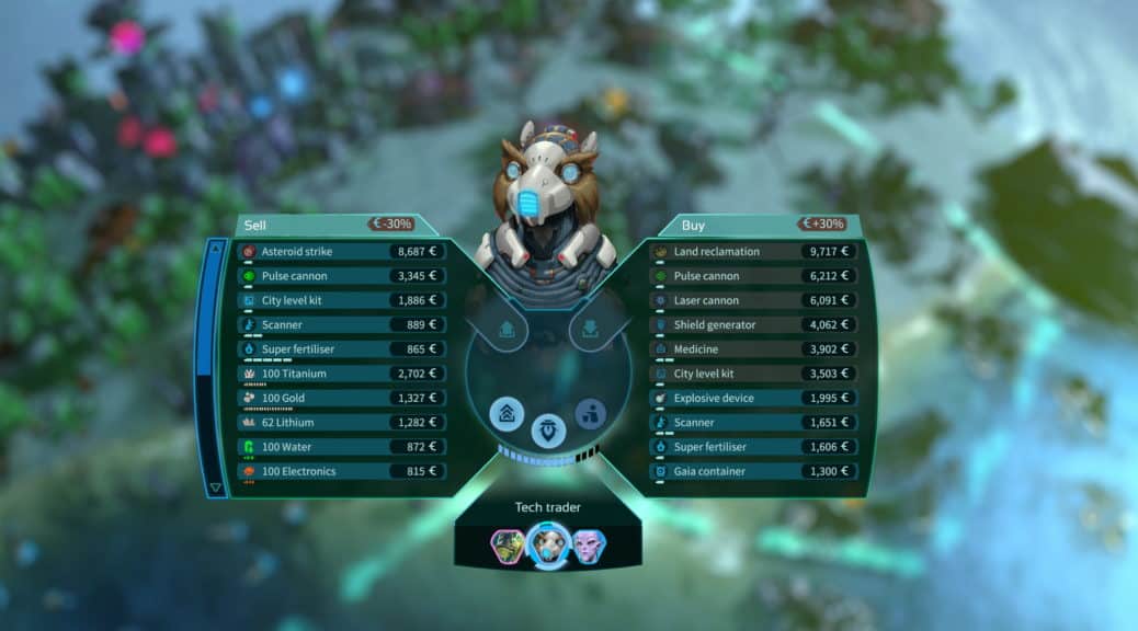
You can now trade and do diplomacy with all sorts of partners through the interface without having to jump to you with the camera. This way, you are not always pulled out of the local action on the planet because of crafting or item acquisition, and you always keep track of what’s going on.
Takeover through stock trading
A separate stock panel right at the frasction panel, where you can see all the information about a company’s cities and directly buy shares and take over cities. A big button that flashes visibly and visualizes the takeover process.

We built a large popup that solemnly announces that you have successfully taken over a city. And also indicates if you have captured equipment in the process, which means you have taken certain items from the enemy.

We also restructured the stock trading panel so that the player always automatically starts at himself and can more quickly throw some shares on the market to get new capital.
Setup optimizations
The difficulty button has been redesigned to look the same in the setup for new rounds of competitive and endless play as the other options or tabs in the setup menu. The start button has been enlarged.
Also, you can now turn off Gaia Forces and Asteroids in the game for a more realistic gameplay experience that is mainly about global warming and environmental issues rather than futuristic sci-fi elements.
Fossil buildings
Fossil power plants can now drill and exploit deposits in adjacent fields. This keeps them productive longer and means they need to be moved less often.
In exchange, fossil production buildings have again received a malus. It no longer looks in the game as if there would be no problem at all if a certain resource is not available.
This is especially important in the context of the core message of the game. Fossil buildings that just keep on working, that too is unrealistic.
The new taskbar
The taskbar has been made narrower. Options like Research and Technology, which are already positioned in the top left of the interface, are no longer duplicated there.

Gamepad layout
We didn’t spare ourselves and once again tweaked the configuration of the controls. There is a new control pad ring menu with which you can control many things in the game even faster than with a mouse.
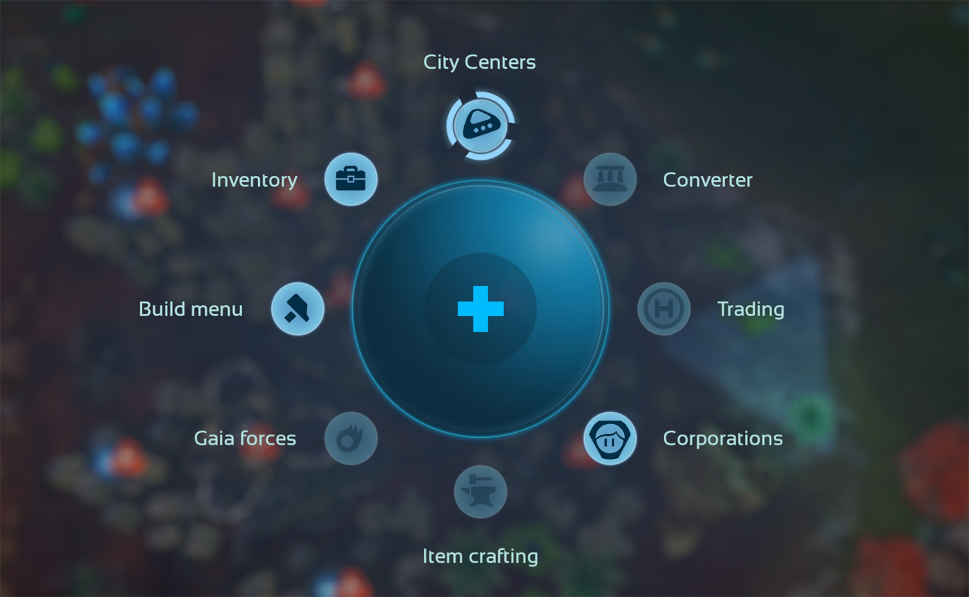
In all ring menus, the D-pad or directional pad can now be used to navigate particularly quickly and directly, select a build option or item.
Jumping to an event or an alarm. Has not worked for a while. Is now, however, on the left stick.
Supply capsules
Had literally disappeared from the game. On medium setting, such a vehicle now lands again every 5-10 minutes.
Navigation
We cleaned up the navigation so that too many enemy cities are no longer displayed around the globe at once.
Optimizations
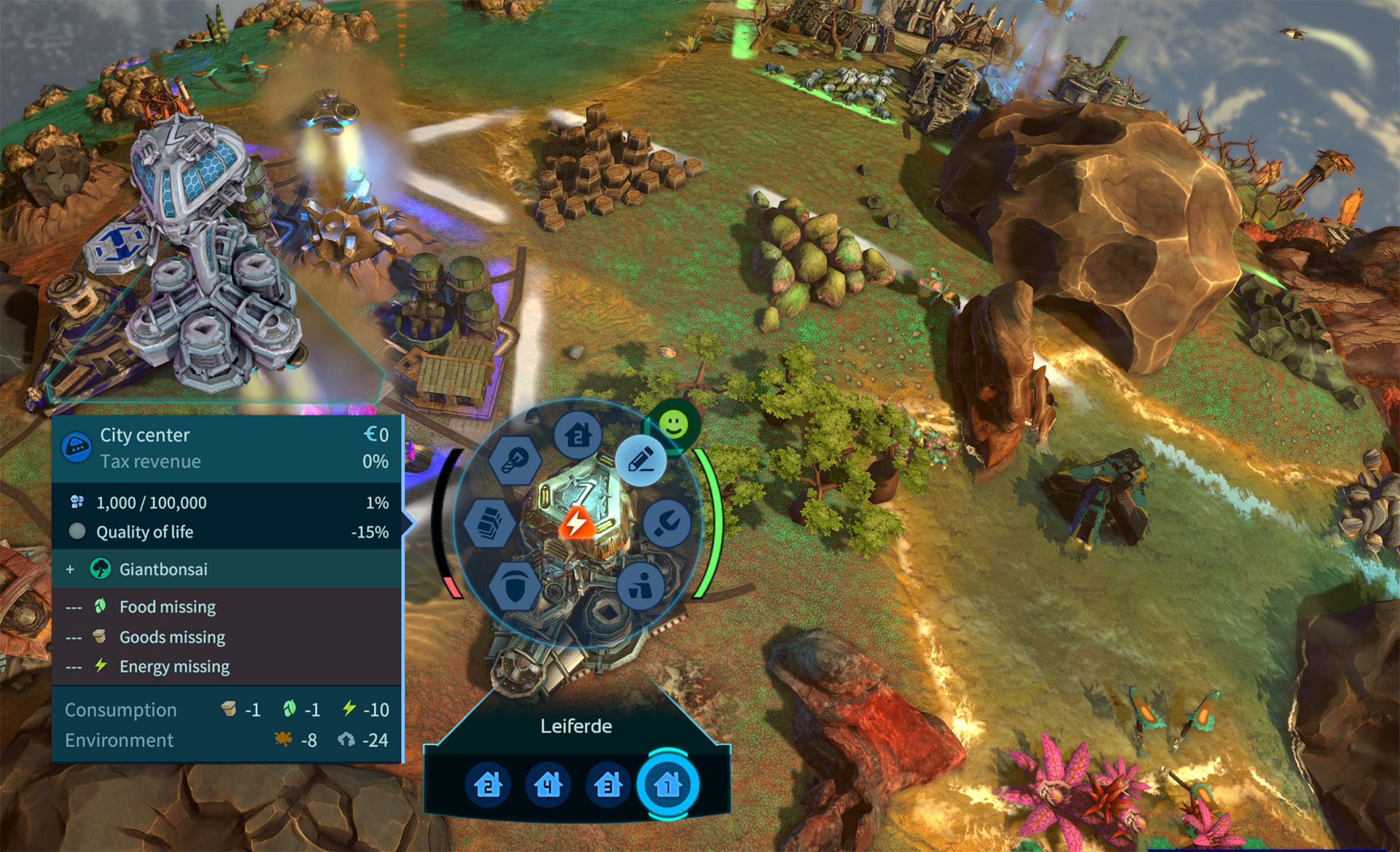
- In the field ring, the updates of houses, are now displayed on the right and thus it is no longer too long on the left, so that information sometimes hangs pointlessly out of the screen.
- The buttons for diplomacy no longer show all the time, all the details that play a role there. This makes the user interface much narrower.
- Auto-harvesting now also works for temple ruins from which artifacts are harvested.
- When a building ring has a panel open on the left, the building info is displayed on the right.
- In the colony rating screen you can now select the different factions.
- Citys Panel – Merchants, Workshops and Temples now only displayed at cities when hovering.
Bugs
- We have 5 bugs that have been sent to us via Discord.
- Factions often built too many towers next to each other and also liked to place City Centers in clusters or in a pile.
- The controls in the build menu were a bit disjointed.
- The build menu can now stay open with the gamepad, so you can always see your list of strategic items.
- In the Weekly Challenge, the gamepad cursor disappeared until you pressed something.
- “Show Influences” in the Technology panel was not selectable with gamepad.
